Brown is the New Green
In spite of Pantone’s egregious error, brown will be my color this year. And I will feel grounded and connected to the land – this land, my landscape, as well as the whole of Earth – as never before.
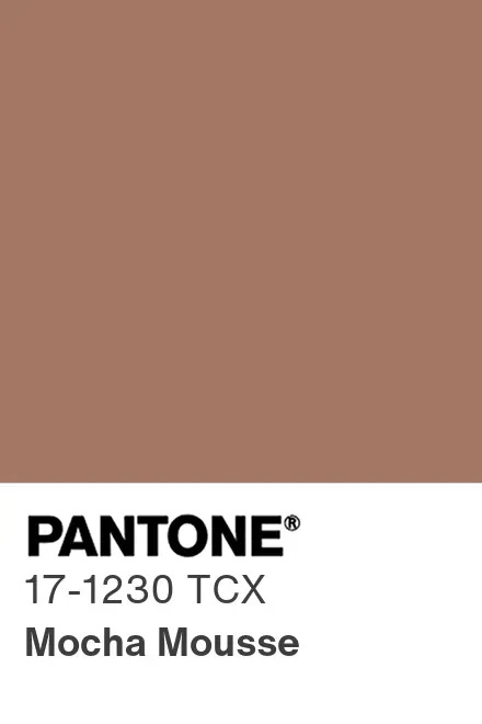
Pantone’s pick for color of the year upset me terribly. For 2025, they chose something called Mocha Mousse. I like mocha. I like mousse. I do not like this color, nor do I think it looks remotely delicious. It’s the color of my father’s Ensure drink. It’s mauve having a bad day. It’s a truly crushing car interior color – the color you get when you buy a car with an exterior color called Sunset Bronze or Pearl Emberglo. There’s too much blue in this brown, giving it a greyish, violet hue that resembles my childhood watercolor set after I’d finished feverishly mixing all the colors together. Bleh!
The thing is, I love brown. When I was young and skinny, I had a favorite outfit of brown tights, a groovy brown and lime green short skirt, and a dark chocolately-brown wool sweater-jacket. Brown loafers. Loved that. My favorite corduroys were brown. I had a hip brown hoodie with turquoise piping that I picked up at a street fair in SoHo. When I was editor of Fine Cooking, my staff used to kid me about my love for brown food. At recipe tastings in the test kitchen, I always wanted everything to be (more) caramelized, to be colored up, to be roasty toasty.
It’s not that brown is my favorite color. At least I never thought it was. I’ve been stubbornly loyal to pink forever and ever. And yet.
When I saw the Pantone color pick, all I could think was, “Of all the browns in the world, did you have to pick this one?” I mean, it will probably be another fifty years before they choose a brown again, so it seemed to me they had blown their chance to showcase a truly rich, warm brown. Or even a cool, sleek dark chocolate. Anything other than this one! Oh, they dressed it up on the website to make it look like it could be “interpreted” (in fashion, home design, etc.) as chocolate mousse-y. But mousse is not one color; depending on how the light hits it or how a spoon swirls through it, it is multiple shades of brown. And there is no movement or sparkle to this Pantone Mocha Mousse. It is a decidedly flat color. Mocha Mousey would be a better name.
Obviously, the Pantone folks did not consult me about this, nor does anyone really care about my opinion. And I haven’t heard any hue and cry from the design world over it. I guess everyone (maybe even you!) either loves it or is indifferent to it. Pantone’s partners are happily making Mocha Mousse-colored earbuds and Post-It notes and phone covers. Even the ordinarily delightful Spoonflower is using Mocha Mousse in some of their fabric designs.
But I was so irritated about this choice that I set about pulling brown photos from my photo files.
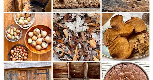
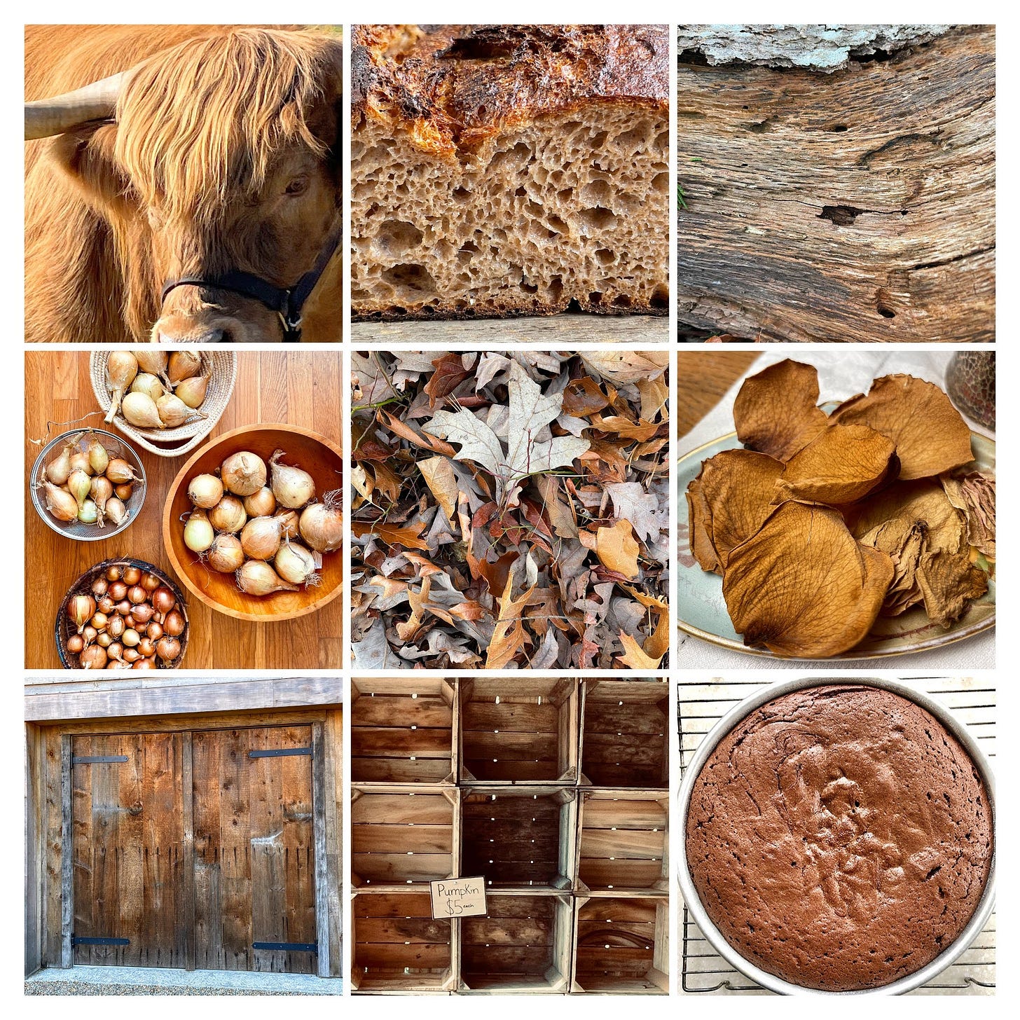
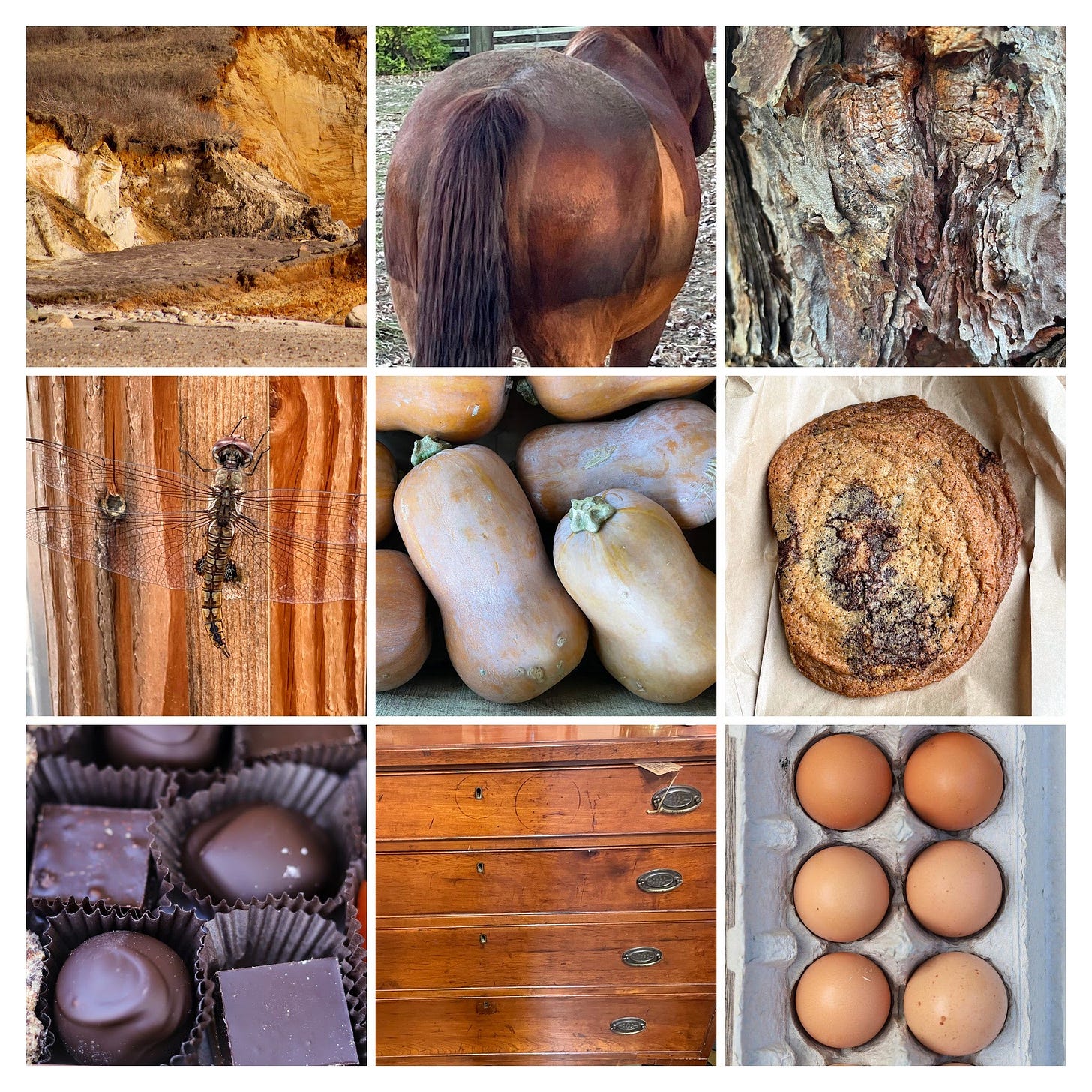
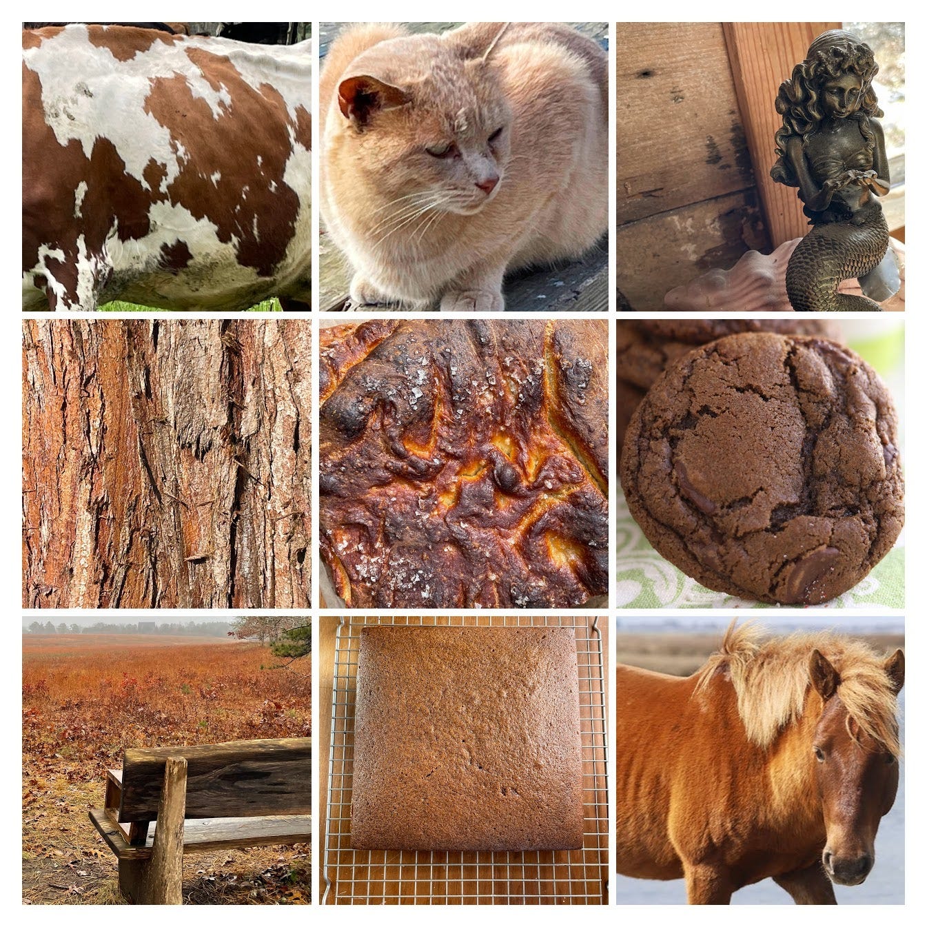
I took the photos and turned them into collages that pleased my eye. “There,” I said. “Those right there are some darn pretty browns.” I intended to share the collages with you, but never got the chance when December turned a bit dicey.
I left the collages sitting on my desktop and happened to pull them up and look at them this week.
I was kind of taken aback. Because I saw something different in them than when I put them together. When I made the collages initially, I was mostly concerned with color, with choosing a range of rich browns. Of course, I did use search words like “chocolate” and “wood” and “leaves” to find the photos. But I didn’t really think about why.
Now here I was, looking at the collages as a whole and feeling deeply comforted and grounded.
Looking more closely, I noticed that the photos were, for the most part, born of the landscape that I so treasure. The ubiquitous crinkly oak leaves, fields turning copper at sunset, nutty peeling bark, clay cliffs and cow hides, horse hineys and a barn cat. Brown eggs and Honeynut squash. Dried rose petals. Onions from my own garden. Wooden farmstands, inside and out. I left out two of my favorite browns – the dark peaty earth beneath our feet on our walks through the woods and the crumbly brown earth in our compost pile – only because the camera has a hard time with these subjects.
The few photos that weren’t tied to the land were of freshly baked bread, some made from locally grown grain. A fine old piece of furniture. Gingerbread. And my beloved chocolate.
Here was an intimate look at what moves me. In these collages is the gratitude I have for the Vineyard, for the way it has offered me a path back to nature, and to myself. Brown is the color of the earth, the earth that brought me healing – and as I’m just starting to realize, a new kind of spirituality.
Lately, as you’ve probably noticed, I’ve taken an interest in mysticism and Celtic spirituality. I don’t know very much about either, which perhaps explains why it is just dawning on me that all of these experiences I’ve had, from noticing the dragonflies to feeling closer to the spirit in certain places on my walks, are like those of people who believe that God (or the Spirit) is found in all of creation – that every human being and every living thing, as well as the Earth we live on and in, is sacred. (Of note is that many of these folks have relinquished their observance of formal church creeds and doctrines.) I think I was trying to get at that idea a little bit in last week’s post, when I wrote of the need for us to acknowledge our interdependence with nature.
My friend
, who writes an excellent Substack called Finding Your Soul, introduced me this week to the writings of John Philip Newell, an internationally known teacher and authority on Celtic spirituality, who emphasizes the sacredness of earth in his teachings. I am looking forward to reading his latest book, The Great Search: Turning to Earth and Soul in the Quest for Healing and Home.I feel like the universe is giving me – and my spiritual quest – a nudge, leading me in a fresh and exciting direction. I want to dig deeper into this realm, spend more time in stillness and mindfulness in nature, open myself up to more ways that I can learn from the Earth and all its living creatures.
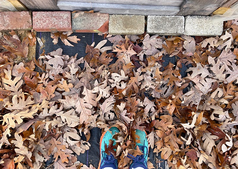
If I am to be truly fair, I guess I should start by forgiving the Pantone folks and perhaps embracing Mocha Mousse. Because after all, nature is the mother of all color. If I squint, that Mocha Mousse looks like the spots on an eggplant when it starts to rot. Oh, sorry. I could be kinder. I’m sure somewhere in this pile of leaves at my feet is a swatch of Mocha Mousse. Just waiting for its year – 2025.
“What we do to the earth, we do to ourselves. What we do to life on earth – human and otherwise – we do to ourselves.”
— Samantha Harvey, author of Orbital, in her acceptance speech for the Booker Prize.
(Listen to Vanessa Redgrave read these words below.)
Disclosure: I am an affiliate of Bookshop.org and I will earn a commission if you click through and make a purchase of a book I have highlighted.
💚






Crazed with love for this post (and brown). It IS an egregious error and your description of watercolour mess is absolute perfection. What were they THINKING? Collages extremely soothing though, so thank you.
Wow, I've been transported to all my favorite earthy nature moments. This is brilliant. Thank you.